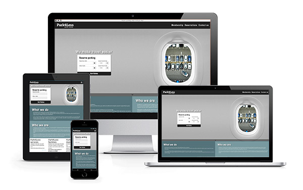
Responsive Design
The transformation of your website, so that it will work and display,
according to each device and screen size.
according to each device and screen size.
In recent years, the number of people using tablets and mobile devices to surf the internet has overtaken traditional browsing through a desktop computer. This can result in many problems in the appearance of web pages, because of the variety of the devices, their screen size resolution and various incompatibilities between them.

A solution to avoid this kind of problems is the use of Responsive Web Design.
The way this works is for the web application to detect the device of the visitor and the dimensions of the screen and then automatically re-form to suit the device. When a visitor uses a device with relatively large dimensions (i.e. more than 1000px), the page view is displayed normally showing as many objects as possible. In screens with smaller dimensions, the objects are rearranged to fit the available space.
In general, the design of a website utilizing a responsive web design is not easy. The designers and the developers should be well aware of HTML, CSS and JavaScript, and of course to have very good cooperation with each other to achieve the desired result.
At Analog Web Solutions, we can guarantee with certainty that the design and development of your website will be done with absolute precision and proper infrastructure so it will be Fully Responsive. Your visitors will enjoy the same friendly environment, no matter what device they use. Having a website or online shop that is accessible from all different devices simply means more visitors will stay and browse your website which translates to more customers and an increase in sales and profit.
Key advantages of a responsive design
We have a website which behaves like 2 in 1. We can visit the website without any problem from either a PC or a mobile device having the best navigation experience (mobile friendly website).
Google Analytics. A single responsive site means that you no longer have to track user journeys, conversion paths, funnels and redirections between your sites.
Maintain website structure. Common links that will respond perfectly, irrespective of the type of device.
SEO. One url includes all the links that we want.
Ease of maintenance and reducing errors. It is better to maintain a single website, rather than three (one for PC, one for tablet and one for mobile phone).
Cost efficient. Reduction of the website’s structure design time, regarding different devices, which also means of cost reduction.
Something that will surely make you think seriously about the responsive design for your site is that Google has modified its algorithms to take into account mobile accessibility and this has significant impact on your website’s ranking. Thus, the websites that are friendly to mobile devices (i.e. mobile phones, tablets), will get improved ranking from Google than those that do not offer such an experience to users of mobile devices.


 7000 9088

